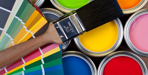
All the top designers have been coming out recently and announcing the big new: color is back! After almost a decade of popular neutrals (especially grey), interiors are once again being decorated in color.
Of course the classic Scandinavian style of white will be in for quite a while longer, but for those of you who are excited about the new color trend, here are a few of the hottest colors being used right now and are predicted to still be in style through 2017.
Enjoy!
GREEN
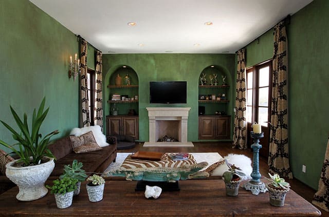 Image Source: Decoist
A rich sage color is a top choice for those who love green. It’s earthy aesthetic offers a warm and welcoming feeling, pairing perfectly with a rustic or Mediterranean design. While mixing sage with crisp whites and soft creams offer quite a classic and clean look, for a more down-to-earth design, look for a darker shade of sage and pair with darker elements such as rich woods, deep blues, and gold yellows.
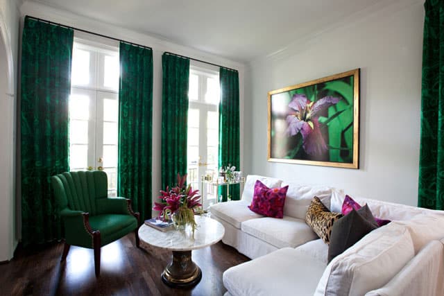 Image Source: Better Decorating Bible
As a color made for royalty, emerald green has been making its mark in luxurious interiors ever since its birth. Showcasing the natural beauty of the emerald stone, this green hue, unlike a sage or olive green, has quite a distinct vibrancy to it making it a showstopper but also not overpowering.
If you love the bold colors, an emerald green might be just what you need in your life. Mixing well with other bold hues, such as deep purples, fuchsias, and blues as well as more understated colors such as white, brown, grey, and soft golds - you really have a lot of options as this color, as bright as it may be, gets along well with other hues.
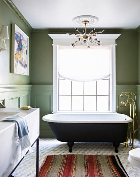 Image Source: Simplified Bee
The soothing beauty of olive green is another adored green popping up everywhere, and its subdued tone allows for plenty of richer colors to make an appearance. Midnight blacks and rusty reds and oranges offer an exotic Moroccan style when combined with the earthy olive color while a simple white and black color palette will present a chic elegance.
Another plus is, if you’ve fallen in love with this year’s metal movement (brass and silvers), olive green will complement your shimmering gold and silver decor.
GEMSTONE
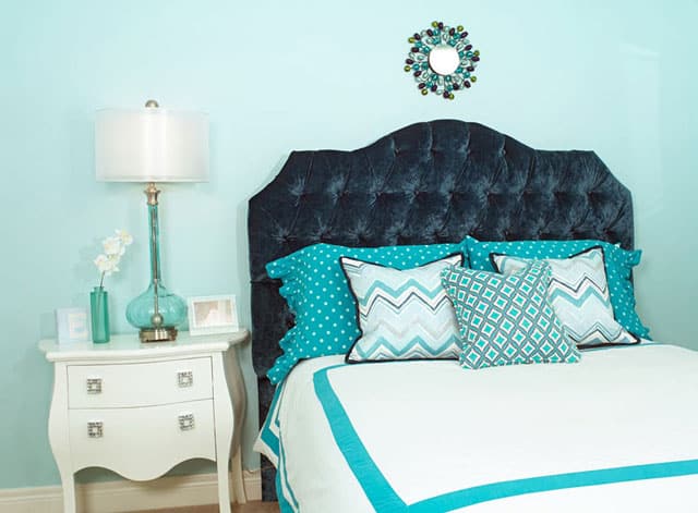 Image Source: Lumar Interiors
For those who love blue but want something more unique and sophisticated, turning to blue gemstone hues may be your answer. Gemstones such as Azurite, Aquamarine, Chalcedony, Tanzanite, and Zircon are all exciting new ways people are incorporating blue. While blue is still blue, these gem tones will add something new and exciting to classic color palettes such as classic blue and white, blue-on-blue, and Parisian-inspired pink and blue.
 Image Source: Lenore Frances Homes & Interiors
Yellow Citrine and Chrysoberyl hues offer a trendy spin to classic, luxurious gold. Pairing nicely with almost any color, incorporating this gem into your home can be used for a powerful statement or an understated one. Pair with black and silver for a dramatic look or with deep pastels for a softer, warmer look.
Yellow-gold gem colors look fantastic in formal dining rooms, creating a fine-dining atmosphere with a polished, sophisticated look. Guests will be impressed with the inviting yellows while your dinner parties will be taken up a notch with the classic colors that represent pure glamour!
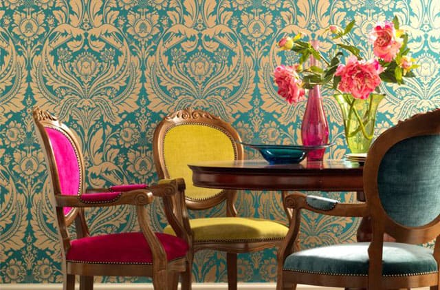 Image Source: Splendid Habitat
Along with golden-yellow and deep blue gemstone colors, pink sapphire is also an elegant choice that’s being embraced these days. A rich fuchsia-esque pink works brilliantly alone, or, for an even more enchanting design, mixed with fellow colors from the gemstone family.
Add this bold color into your home through upholstered seating, glassware, artwork, or curtains. A deep pink, such as pink sapphire, can be used to add color to a minimalistic, neutral interior or as a focal color placed among a variety of other colors. Whichever way you decide to incorporate pink gemstone into your home, you’ll immediately see a punch of liveliness and playfulness emerge.
YELLOW
 Image Source : Nandina Home & Design’s
A soft, feminine yellow such as Daffodil will bring your traditional or farmhouse interiors to the next level! Offering a happy-go-lucky feel and a warm brightness to a space, it’s hard to not fall in love with a yellow interior of this kind! This color looks lovely with virtually any woods, creams, soft whites, and pale greys, making it extremely easy to integrate this shade into a current earth-toned design.
If you have a lot of natural light in your home, consider bringing in textiles in a daffodil yellow. The light will enhance the softness of the yellow, as it is a bright and cheery color but extremely easy on the eyes.
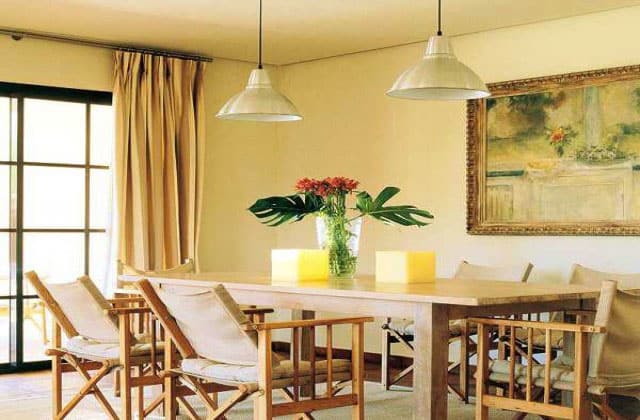 Image Source : Julia Cavallaro Designs
Sand yellow is one of my favorite ways for earth tone diehards to try out! This gorgeous yellow is similar in color to light woods, so, still giving off that au naturale feeling while also being a step in the “color trend” direction.
This sandy yellow works extremely well with any woods, golds, creams, and greens. If you have a rustic interior, try using this shade of yellow as an accent wall - I guarantee you’ll love the results! It’s just an overall friendly color; an inspirational and positive color to wake up to in the morning and a calming color to relax to in the evening.
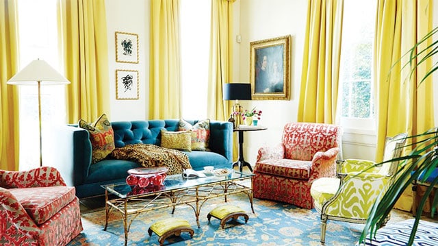 Image Source : DecorPad
If you are loving the yellow look but want something bolder, then a lemon shade is for you! A strong statement but not uninviting to other vibrant colors. Lemon, as one might suspect, looks astonishing with other colors of nature - deep greens, browns, blues, oranges, and reds. It’s a perfect pop of color in an earth-toned interior or also as the main show in a well-balanced color-centric one. You really can’t go wrong with lemon if a) you want something rich and vibrant, b) it’s not too overwhelming (start conservatively), and c) you want to incorporate colors of nature.
Grey-Blue
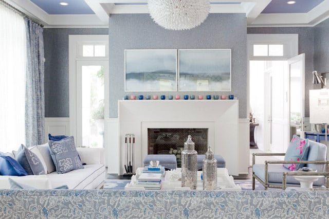 Image Source : Minimalisti
If you’re still loving your grey interior but want to change it up a bit, opt for a light blue-grey. This color still works as a grey, but with the added benefit of cool, calming blue undertones. Pair a blue-grey with varying shades of grey and blue or pair with your dark woods, golds, or crisp whites.
Virtually any design style complements this color, from traditional to contemporary to modern. It’s simplistic enough for minimalistic settings, but can easily be dressed to cater to any look. If you’re going for a fresh and airy feel, try out this color as it’s light enough to never feel heavy but will change slightly throughout the day depending on the light, at times looking more grey and others looking more blue.
 Image Source : Jefftoh
If you want your home to have a moody color palette, a thunder cloud blue-grey will do the trick. The grey hues make for the perfect backdrop to other colors - not too overwhelming, but not black or white, either - while the hints of blue make the backdrop more noticeable. If you’re going to incorporate the color trend through textiles, a grey-blue will accentuate your chosen color palette, especially if you choose mostly cool colors with subtle pops of warm colors.
Another trick that makes this thundercloud color so popular is the benefits it brings to your brightest room - often, a south facing room. This darker shade will bring down the brightness a bit while staying cool and neutral - you’ll barely notice that it’s the wall color effecting the lighting, but you’ll be surprised with how successful it is at softening the space.
 Image Source : K Sarah Designs
While blue and white has been the staple for coastal living designs, dark blue-grey has become really popular for adding a fun twist to this classic look. Pairing wonderfully with creams, browns, whites, and blues - all key ingredients to a clean, coastal interior - the darker shade, looking a bit more blue than grey, adds a gorgeous contrast to the overall neutral color palette.
Another benefit of using a dark blue-grey, rather than a monochromatic grey, is its softer aesthetic when paired with other colors and materials. Woods, backsplashes, and appliances will all merge nicely with the design without looking harsh or cold, as it might with a cooler, flat grey. If you are looking to warm up your interior while still keeping your fresh coastal look and trendy finishes, think about using this friendlier adaptation to traditional grey!
PURPLE
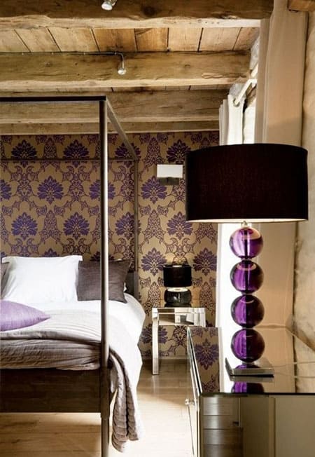 Image Source : DigsDigs
Romantic, sophisticated eggplant is a color that adds class and elegance to any interior. Whether it’s a small touch of this glamorous purple or a large accent, your home will be filled with a luxurious warmth. Often thought of as a color of elite power, eggplant can actually work wonders in adding some natural comfort and beauty to your home; its rich shade creates a moody ambiance, while not looking over dramatic but rather nonchalantly contributing a natural, passionate hue.
There’s not too much you have to do to make this color work in your home, either. You may want to keep the secondary colors as close to earth tones as possible, but eggplant can also look amazingly trendy with other pops of vibrant, warm colors, such as burnt reds, oranges, and yellows.
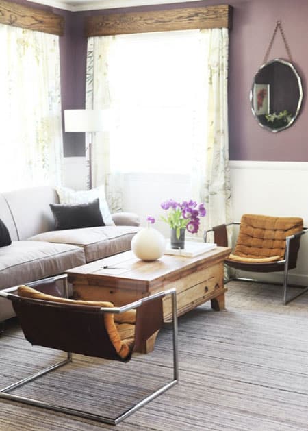 Image Source : Remodelaholic LLC
Similar to eggplant but not as strong in its saturation, this shade of purple adds a soft punch of color which works fabulously with rustic designs. This soft purple will add a unique femininity to your home, pairing lovely with florals, neutrals, and warm earthtones. When adding in bits of color, try using subtle prints and patterns through your textiles as to not make the space too busy on the eye and to keep a harmonized look.
If you’re looking for a color that will enhance the look of your gorgeous hardwood furnishings, this hue might be perfect for your home. Soft enough to not steal the show but apparent enough to gain some of the attention - working this color in with a generally neutral color palette is going to make a naturally stunning statement.
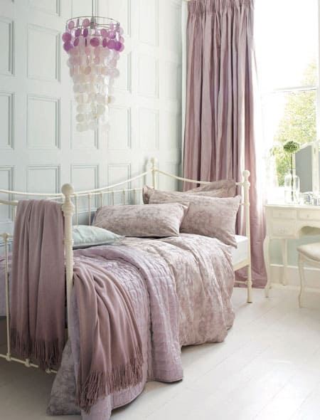 Image Source : Pinterest
The ever-so-gorgeous shade of lavender is thankfully making a comeback! Extremely dainty and feminine, lavender looks gorgeous when on it’s own as well as with other pastel-like colors. Due to its light and airy nature, lavender pairs best with fresh, clean, and bright interiors - showing off its full multitude of beauty! Have this light purple steal the show through gorgeous textiles or work it into your home as a lush background to your light-neutral furnishings - either way, this color will make an elegant statement!
If you’re worried lavender may look a bit childish, allow lavender to add subtle sophistication to your home with smaller bits of lavender here and there. This will provide your already-sophisticated home furnishings to remain somewhat in charge of the look but still give you room to slowly add in more of this gorgeous color.
PINK
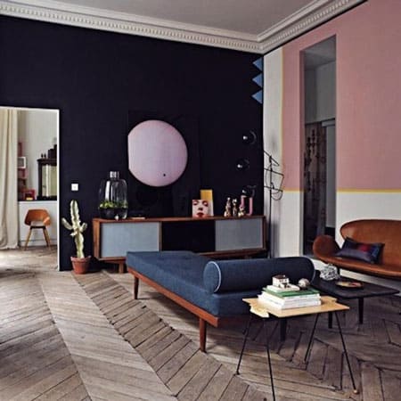 Image Source : Elements Of Style
Create a Parisian-inspired home with a pretty-in-pink interior! Blush pink works extremely well with darker colors such as Prussian and Oxford blue - and is a super classy color combination! Blush pink can be used boldly, but when doing so, try to keep your furniture subdued with brown leathers, woods, and greys.
Scared to dive too quickly into the world of pink? Acquaint your color taste-buds with a blush infused area rug; this won’t be too daring but also won’t be too scarce either. This is a wonderfully mature color, despite what anyone says about pink in general, and can be added to your home in subtle yet bold ways. I guarantee, if you love a refreshing color, you’ll want to give your home a splash of blush!
 Image Source : Housetohome
Classic rose is another shade of natural pink that is popping up everywhere! As this rose is a bit more saturated than blush, one might want to err on the side of caution at first. Bring this romantic shade into your interiors through details - such as with throw pillows and patterns.
Rose merges nicely with browns and greys (as long as the grey is on the lighter side) as well as with currently-trendy brass and silver decor, making this the perfect color to introduce into your home if you want to update your already on fleek interior design. For a romantic, whimsical design, complement rose pink with a moody thunderstorm grey-blue or splashes of deep reds. No matter what look you want to achieve, from trendy to feminine to romantic, rose pink can get you there!
 Image Source : Project Fairytale
Beige pink - a perfect meeting place for those neutral diehards and color curious DIY designers. If you have fully embraced a monochromatic interior - which is sophisticated and chic in all it’s glory - but want to add in a bit of versatility and comfort, you may have found a new best friend in beige pink.
So close to beige but a bit more interesting, beige pink will mix well with most color palettes, including metallics, rustic woods, neutrals, and moody earthtones. If you want to go bolder and brighter, test out a small sample of pink beige before going full throttle, as for an interior filled with cool blue undertones, the pink hues may look a bit off balance.
Enjoy trying out these new 2016-2017 color trends! As you may have noticed, all of these colors can also be found in the beautiful outdoors - which is being implemented into design more and more, so keep an eye out for this growing trend!
