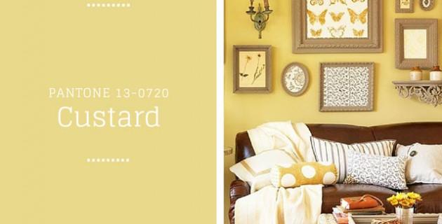
I have always enjoyed looking at interiors that feature yellow, as it can totally change a space.
By adding a bright ‘pop’ of color in an otherwise sparse room, it can lift your spirits to make you feel happy and energized. I wanted to see how the Pantone shade ‘Custard’ is being used in interior design to bring life into the home or workspace. There are so many beautiful images on Pinterest, I was really spoilt for choice this week! Here are a few of my favorites for you to check out……
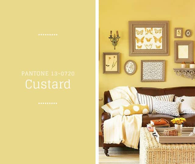
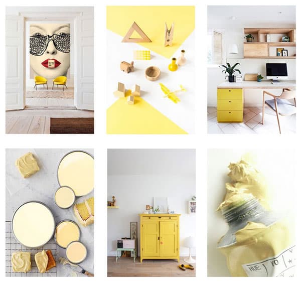 Image Source - KID Pinterest
The custard tones seen in the images above (taken from the awesome Colors We Love board that I follow every week) are a mix of buttery shades to almost ochre tints. From chairs, carefully selected objects, office drawers, and paint, this color is definitely a shiny happy hue that you need in your life!
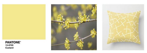 Image Source - KID Pinterest
Flowers in bloom next to the custard yellow shade, shows a strong color personality that is sweet, yet comforting.
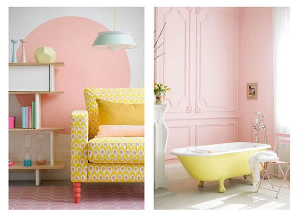 Image Source - KID Pinterest
This sunny yellow shade can look even better when paired with other soft pastel shades. In the images above, the gorgeous light pink really makes the yellow catch your eye. The image with the patterned fabric covered chair has other pastel objects that work so well, when placed next to yellow.
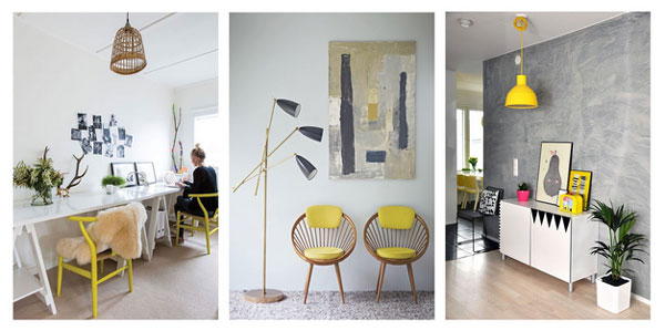 Image Source - KID Pinterest
Yellow can also work really well when paired with an open white space, or grey tones. The first image above is so amazing - I really want to have that workspace! The simple lines of the yellow chairs look great, as the only objects of bright color in the room. In the next image the wicker chairs have yellow fabric pads, that reflect some color shown in the wall art above. The third image is a mainly white and grey room that has a fantastic bright yellow light fixture, matched with yellow home decor accessories. This color can really make an impression by offering something positive into your space. I think this color is great and would love to have it in my home!
Atlanta design firm Nandina Home and Design often use this color in their soft furnishings and wall art, to compliment their neutral color schemes.
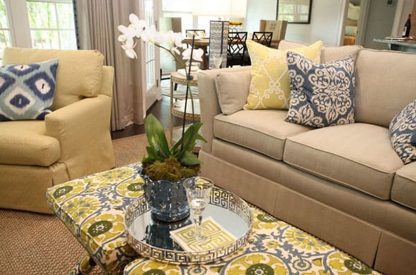 Image Source - Nandina Home & Design
A yellow patterned pillow is matched with ikat printed pillows to add color to this neutral living room. The subtle yellow armchair fits in well to add a comforting vibe. I love the patterned fabric that covers the table/seat - those blue and lime green colors are so stunning together!
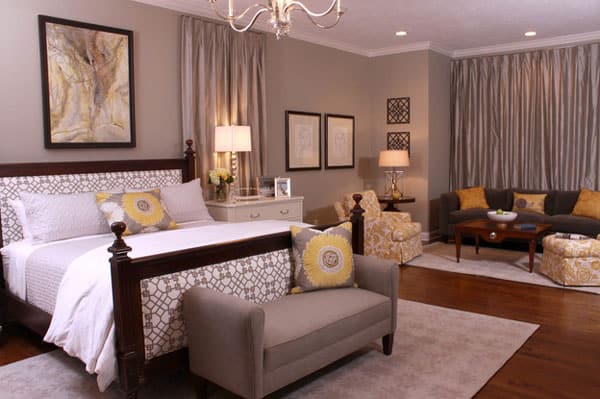 Image Source - Nandina Home & Design
A gorgeous bedroom in mostly neutral colors, with sumptuous textiles and soft furnishings that give the room a really comfortable yet stylish feeling. I love the use of yellow in this room, it is a subtle addition, seen in the pillows, the wall art and the patterned chair. I would love to have a bedroom large enough to fit a whole lounge area - I don’t think I would ever want to leave!
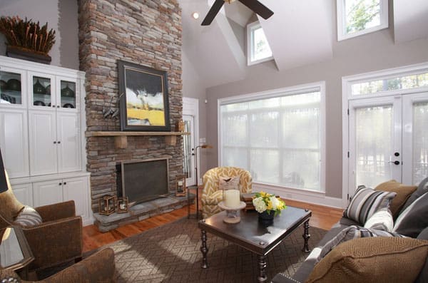 Image Source - Nandina Home & Design
An elegant living room with a textured brick wall fireplace that is the center of attention in this open space. The custard yellow patterned chair is complemented by the wall art, which adds a color burst into this neutral area. The vase of yellow flowers on the coffee table also adds a bright flavor to this space. I love the high ceilings with those small windows, what a great space to sit and relax. I would love to be invited over for a nosey around this house!
