Choosing a color palette for your home can seem daunting, but help is here! The right choice of colors can transform a space from dull to stunning and could significantly improve the resale value of your home. Below are some of the basics of choosing the right colors to make your home feel harmonious, aesthetic, and an object of envy!
How to Find Inspiration for Your Color Palette?
Inspiration can be found in the most unexpected of places, so keep your eyes open for things that strike you as attractive. Here are some ideas:
Choose a Color From the Prominent Decor
Picking paint colors from existing decor items can help create a harmonious flow in the space. Look around your home and identify a color from a print or a pattern that stands out prominently. It could be an area rug you love or a floral design on your favorite upholstered couch.
Choose From Your Closet
The clothes in our closets display the colors we tend to veer towards. So take a close look to identify what colors stand out prominently, and you may find the all-important color palette clue there!
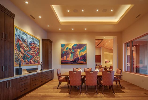
Pick a Color Theme From a Fabric You Like
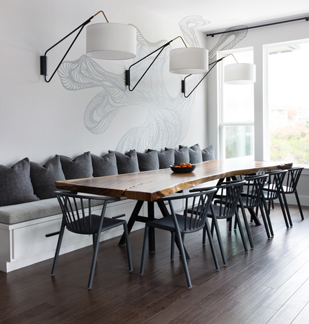
Own an heirloom rug that you love? Love the colors on the curtains in a home decor store? Found yourself staring at the magical colors in a stunning artwork? Reminiscing about a hotel room wallpaper you loved? Have photographs of intricate, colorful Moroccan tiles from your travels? Take a cue. These are all sources of inspiration for your color palette.
Use a Color Wheel
If you want a simple way to help think through colors, then befriend the color wheel! The color wheel has primary, secondary, and tertiary colors, a combination of which can help you create beautiful color schemes for your home. There are four possible combinations the color wheel can create:
1. Monochromatic – using different shades of the same color
2. Analogous – using colors next to each other on the color wheel
3. Using two contrasting colors from different parts of the color wheel
4. Complementary – Using two directly opposing colors on the color wheel
How to Start?
Start With Formal Areas
Experts suggest starting the paint selection process with formal areas such as living, dining, and entryway. Some also prefer to select colors starting from the most used spaces in the house, usually the kitchen and living areas. Once these areas have been decided, choose a toned-down version of one or two of these colors for private spaces to ensure continuity, yet differentiate the spaces according to function.
Choose Colors by Room Type
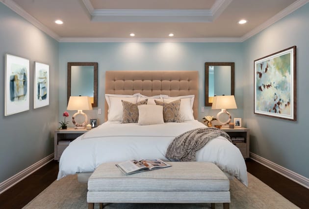
Paint colors can profoundly affect the emotional state of mind and can calm and uplift moods. This also makes it easier to select colors according to the function of each space. For example, using soothing colors in the bedroom can induce relaxation, sleep, rest, and rejuvenation. Warm, earthy colors, soft greens, pale lilacs and blues, creams, and greys are hot favorites for bedrooms. Cheerful colors like bright blues, yellows, light pinks, and lilacs are great for kids' rooms.
Try the Risk-free Template
If you are hesitant about experimenting with colors, you can go the risk-free way by working vertically upwards from dark to light. This involves a dark floor, medium color values for the walls, and a light color for the ceiling. This formula is a sure-shot, risk-free way to achieve harmony in any space.
Try the 60-30-10 Rule
This color palette ratio is guaranteed to achieve balance and harmony – and offer interesting pops of uniqueness. According to this rule, 60% of a dominant color is reserved for walls, 30% of a secondary color is for the upholstery, and 10% of an accent color is for the decor. Similarly, another simple rule to follow is to limit the maximum number of colors to three – one neutral color for the walls and two others for the ceiling and trim.

Pro Tips for Planning the Perfect Color Palette
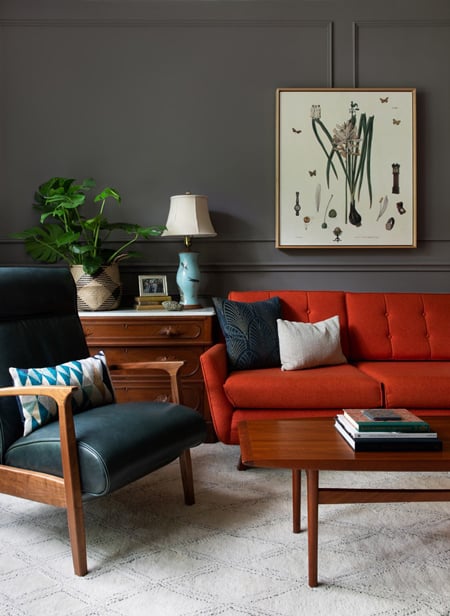
Timeless Trends With Classic Color Pairing
A simple way to achieve a timeless look is by pairing classic combinations like blacks and whites. The pairing is dynamic, bold, and sophisticated, and when combined with thoughtful decor and accents, it can really make a space pop in both casual and formal design styles.
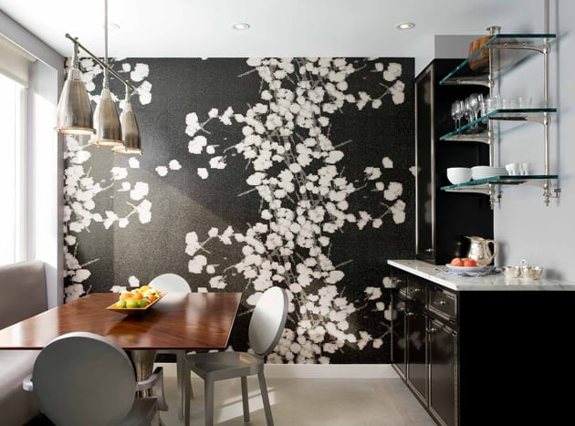
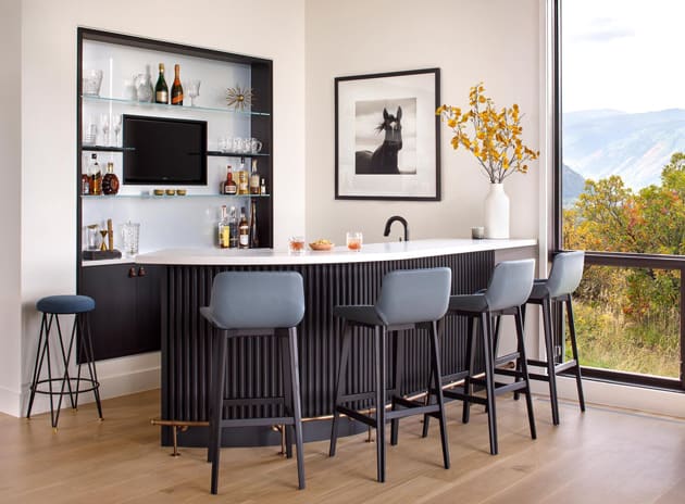
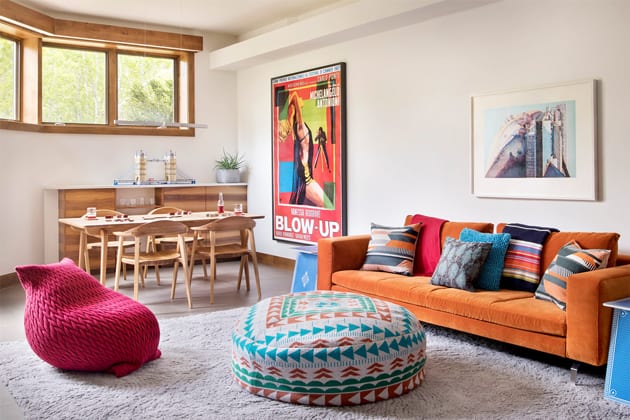
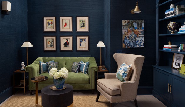
Add Bold Colors to Smaller Spaces
It is common practice to use lighter colors in smaller spaces to create an illusion of spaciousness. But try painting those smaller spaces such as a breakfast nook, pantry space, or a corner library in a bright color and let them make a bold statement.
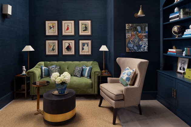
Try a Monochromatic Look With Your Favorite Color
Let go of the neutrals. Get creative and try a monochromatic look with your favorite color. When balanced with the right flooring and decor, the monochromatic paint can enhance a space's appeal.
Stay True to Your Tastes
Sometimes you have to let go of rules and principles and flaunt your colorful personality, whatever color that may be! People will appreciate you for ensuring your home reflects who you are!
Conduct a Trial Run
If you are a do-it-yourselfer, a great way to avoid a color palette blunder is to sketch out the floor plan and color the layout with your choice of colors. Once you have it on paper, get paint swatches and paint a sample in each space on the paper. This will help you get a holistic idea of how the colors will interact from room to room.
Yet this is probably the opportune moment to say that if you can afford a professional interior designer, you should get one without hesitation. We don’t design our clothes and cars; why would we think we are qualified to design our homes. Pros simply do it better, and they manage the complexity of the process for you. Pros help minimize mistakes, which makes them an excellent insurance policy!
The Dance of Lighting and Color
It is essential to understand that colors look different under various light sources. A pro tip is to paint a sample on a wall and spend time in the room at different times of the day to see how light reflects off the painted surfaces to help you make the right color decisions.
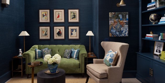
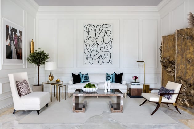
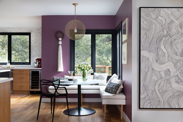
Repeat Colors From Room to Room
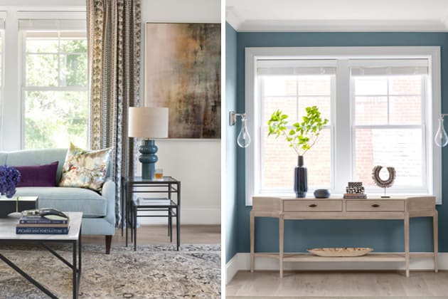
One way to maintain harmony throughout the home is to repeat paint colors. For example, a dominant color in the entryway can be an accent color in the living room and a secondary color in the living room can be a primary color in the dining room. Or, you can match your decor pieces with accent wall colors to achieve a cohesive look, as seen below.
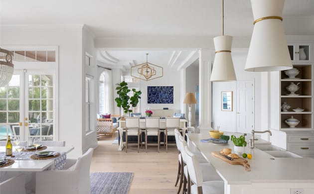
Keep the Paints Cohesive in Open Floor Plans
Open floor plans encourage socialization and efficient use of space. Maintaining a cohesive flow from area to area is essential, thus the value of using a seamless color palette. Neutrals are a great way to achieve cohesion, but you don't need to stick to neutrals. Painting a single color for a continuous wall and other colors for unshared walls can brighten up a space and also create a balanced appeal.
A Color Balanced Home
A carefully planned color palette can brighten up your home and your life! Colors can affect moods and help uplift, cheer you up, or relax your mind. Besides, a perfectly painted home can be appealing if you're planning to sell the house. If you're unsure how to paint it right, I highly recommend you consult a professional interior designer to help you achieve the colorful home of your dreams! ♥
